Portfolio Page That Converts: The Anatomy of One That Actually Books Clients

A portfolio page that converts is one that treats your project showcase like a landing page, not a gallery: it opens with who you serve, structures each project as a mini case study with a challenge and outcome, backs itself up with reviews and trust signals, and ends every section with a clear next step. If your portfolio is just pretty photos with no story and no call to action, it's costing you leads — regardless of how good the work looks.
For contractors, clinics, and creative or professional service businesses, the portfolio page is often the page prospects look at right before they decide to call. That makes it one of the highest-leverage pages on your site.
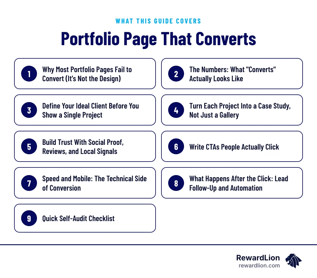
In this guide you'll learn how to:
- Define your ideal client at the top of the page
- Turn each project into a short case study
- Place reviews and trust signals where they help most
- Write calls to action people click
- Keep the page fast on mobile and follow up on every lead quickly
Why Most Portfolio Pages Fail to Convert (It's Not the Design)
The three non-visual reasons
Most portfolio pages fail for three simple, non-visual reasons: there's no clearly defined ideal client, no visible way to make contact, and no clear call to action (nusii.com). You can have a beautifully designed gallery and still lose nearly every visitor because they can't tell who you're for or what to do next.
Structure beats decoration
The fix isn't a redesign with more white space. It's structure: define your audience, tell a story with each project, and guide the visitor toward a next step.
The Numbers: What "Converts" Actually Looks Like
A benchmark for your contact rate
It helps to have a benchmark. The average landing page conversion rate across all industries is 6.6%, based on a Q4 2024 analysis of roughly 41,000 pages and 464 million visitors (Unbounce). That's a reasonable reference point for your portfolio's own contact or quote-request rate — not a guarantee, but a gauge for whether your page is underperforming.
Mobile and desktop visitors
Traffic patterns matter too. Mobile brings in nearly five times more visitors than desktop, but desktop users convert at roughly 8% higher rates (fibr.ai). That tells you the page needs to be mobile-first in layout, but desktop visitors — often further along in deciding — still deserve a frictionless path to contact.
To measure your own page, count the visitors to your portfolio page each month and the quote requests or calls that came from it. Compare month to month, and note what changed on the page in between.
Define Your Ideal Client Before You Show a Single Project
Lead with a positioning statement
The strongest portfolios open with a positioning statement defining who the owner serves and what they specialize in, before any project grid appears (typza.com). This pre-qualifies visitors — casual browsers step away quickly, while the right-fit prospects stay and keep reading.
Let visitors self-qualify
The most effective version of this lets visitors self-qualify through niche-specific copy. A page that explicitly states it serves, say, small businesses and startups helps prospects immediately recognize fit or lack of it (ConvertFlow). For a local contractor, dentist, or law firm, this might mean naming the service area, the specialty, and the type of client you do your best work for — right at the top of the page.
A simple way to write your opening line is to fill in this pattern:
- Who you serve: the type of client or project you do your best work for
- What you do: your main service or specialty
- Where you work: your service area, if you're a local business
- Why choose you: one specific reason, such as a process or a specialty
For example, a generic remodeling contractor might open with: "Kitchen and bathroom remodels for homeowners across the county — planned in detail before the first wall comes down." If your positioning still feels unclear, our branding and identity work starts here.
Turn Each Project Into a Case Study, Not Just a Gallery
What every project needs
The difference between a weak portfolio page and a strong one is rarely visual polish. It's whether each project gives the visitor a clear challenge, explained decisions behind key choices, an honest outcome, and a next step instead of a dead end (bmg.com.hk).
Story before visuals
Each case study should open with the challenge and context. Visuals attract attention, but story builds confidence (typza.com). A before-and-after photo is nice. A photo paired with "here's what the client needed, here's what we decided and why, here's the result" is what actually moves someone toward hiring you.
A case study template you can reuse
| Part | What to write | Example (generic remodel project) |
|---|---|---|
| Challenge | What the client needed and why | A dated kitchen with poor storage and lighting |
| Context | Limits such as budget range, timeline or site conditions | An occupied home, so work had to be phased |
| Decisions | The key choices you made and the reason for each | Reworked the layout to add storage instead of expanding the room |
| Outcome | An honest result you can stand behind | Finished on the agreed schedule; the client left a review |
| Next step | A link or button to start a similar project | "Start your kitchen project" |
See how we lay out our own case studies and portfolio for more examples of this structure.
Keep it honest
One more rule worth following strictly: label concept or sample work clearly and separate it from real client work, and never report a result you can't substantiate (bmg.com.hk). Honesty is part of what builds the trust that drives conversion.
Build Trust With Social Proof, Reviews, and Local Signals
Put proof next to every CTA
Pages with testimonials or reviews convert about 34% higher than pages without them (fibr.ai). That's a strong argument for placing a review, a quote, or a trust badge near every CTA on the page — not buried on a separate testimonials tab.
Reviews and local signals
This is also where review generation and local SEO work together with your portfolio. A steady stream of fresh reviews, paired with local signals like service-area pages and consistent business information, reinforces the same trust your case studies are trying to build. RewardLion's review generation and local SEO/GEO services exist specifically to feed this part of the page.
Ways to add proof without cluttering the page:
- One short review under each case study, from that client when you have their permission
- A star rating and review count near the main call to action
- Logos or badges for licenses, certifications or memberships you actually hold
- A link to your Google reviews for visitors who want to read more
Our reputation management and local SEO services keep these signals fresh.
Write CTAs People Actually Click
Action verbs and specific benefits
Effective CTAs lead with action verbs — Get, Start, Join, Create, Discover — and promise a specific benefit. "Download Your Free Guide" outperforms a generic "Click Here" because it answers the visitor's unspoken question: what's in it for me? (pixpa.com).
Examples for service businesses
For a service business, this could be "Get Your Free Quote," "Start Your Project," or "See If We're a Fit." The point is specificity. A vague button is a missed conversion.
Where to place CTAs on a portfolio page:
- At the top, right after the positioning statement.
- After each case study, matched to that kind of project.
- Beside reviews, where trust is highest.
- At the bottom of the page, so no visitor reaches a dead end.
Speed and Mobile: The Technical Side of Conversion
Load time
Conversion isn't only about words and structure — it's also about how fast the page loads. Pages that load in one second convert three times higher than pages loading in five seconds, and shaving off just one second of load time can lift conversion by 5.6% (fibr.ai).
Mobile-first layout
Since mobile drives the bulk of your traffic, the page needs to be built mobile-first: compressed images, minimal scripts, and a layout that doesn't force pinching or zooming. This is a core part of RewardLion's web design work — speed and mobile performance aren't an afterthought, they're a conversion lever.
A quick speed checklist for image-heavy portfolio pages:
- Compress and resize photos to the size they're actually shown
- Use modern image formats and lazy-load images below the fold
- Limit scripts and plugins to what the page really needs
- Test the page on a phone over a normal mobile connection
Our website development team builds pages with these checks in place.
What Happens After the Click: Lead Follow-Up and Automation
Seven conversion principles
A conversion-centered design framework rests on seven principles: clarity and focus, structured content, consistent experience, directional cues, trust signals, visualized benefits, and minimal friction (americaneagle.com). Every one of these applies directly to a service-business portfolio page — and minimal friction doesn't stop at the click.
Here is how each principle applies to a portfolio page:
- Clarity and focus: one main action, stated plainly
- Structured content: positioning, case studies, proof and contact in a logical order
- Consistent experience: the same message from ad or search result to page
- Directional cues: headings and buttons that lead the eye to the next step
- Trust signals: reviews and credentials near decision points
- Visualized benefits: photos that show results, paired with the story behind them
- Minimal friction: short forms and fast pages
Close the loop after the click
What happens after someone fills out your form matters just as much as the page that got them there. A lead that sits in an inbox for two days is a lead that's probably already called your competitor. This is where lead follow-up automation — instant text or email responses, appointment scheduling links, and CRM tracking — closes the loop the portfolio page opened.
A simple follow-up flow: an instant confirmation by text or email, a personal reply as soon as possible, a scheduling link for a call, and a reminder if the lead goes quiet. Marketing automation and a sales funnel handle these steps for you.
Quick answers from this guide
| Question | Short answer |
|---|---|
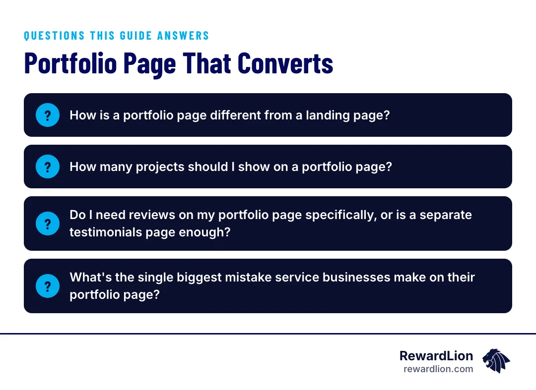
| How is a portfolio page different from a landing page? | A landing page is typically built around one offer and one goal. A portfolio page serves a similar purpose for service businesses — it should guide visitors toward a single clear action, like requesting a quote — while also proving your work through case studies rather than a single offer. |
| How many projects should I show on a portfolio page? | There's no fixed number, but quality and structure matter more than quantity. |
| Do I need reviews on my portfolio page specifically, or is a separate testimonials page enough? | Placing reviews or trust signals near your CTAs, directly on the portfolio page, is more effective than isolating them on a separate page, since pages with testimonials convert notably higher than those without (fibr.ai). |
| What's the single biggest mistake service businesses make on their portfolio page? | According to common lead-generation research, it's usually one of three things: no clearly defined ideal client, no visible way to make contact, or no clear call to action (nusii.com). |
How RewardLion Builds Portfolio Pages That Convert
RewardLion treats the portfolio page as a conversion asset from the start, not a design afterthought. That means:
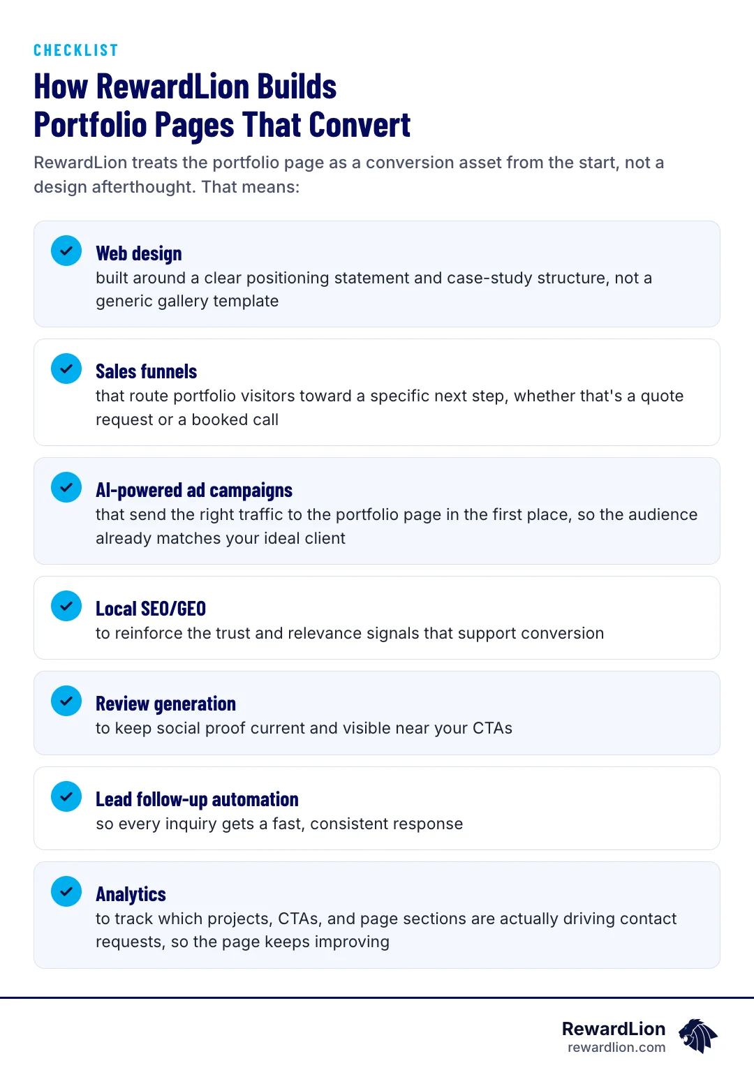
- Web design built around a clear positioning statement and case-study structure, not a generic gallery template
- Sales funnels that route portfolio visitors toward a specific next step, whether that's a quote request or a booked call
- AI-powered ad campaigns that send the right traffic to the portfolio page in the first place, so the audience already matches your ideal client
- Local SEO/GEO to reinforce the trust and relevance signals that support conversion
- Review generation to keep social proof current and visible near your CTAs
- Lead follow-up automation so every inquiry gets a fast, consistent response
- Analytics to track which projects, CTAs, and page sections are actually driving contact requests, so the page keeps improving
Quick Self-Audit Checklist
Run through this list on your current portfolio page:
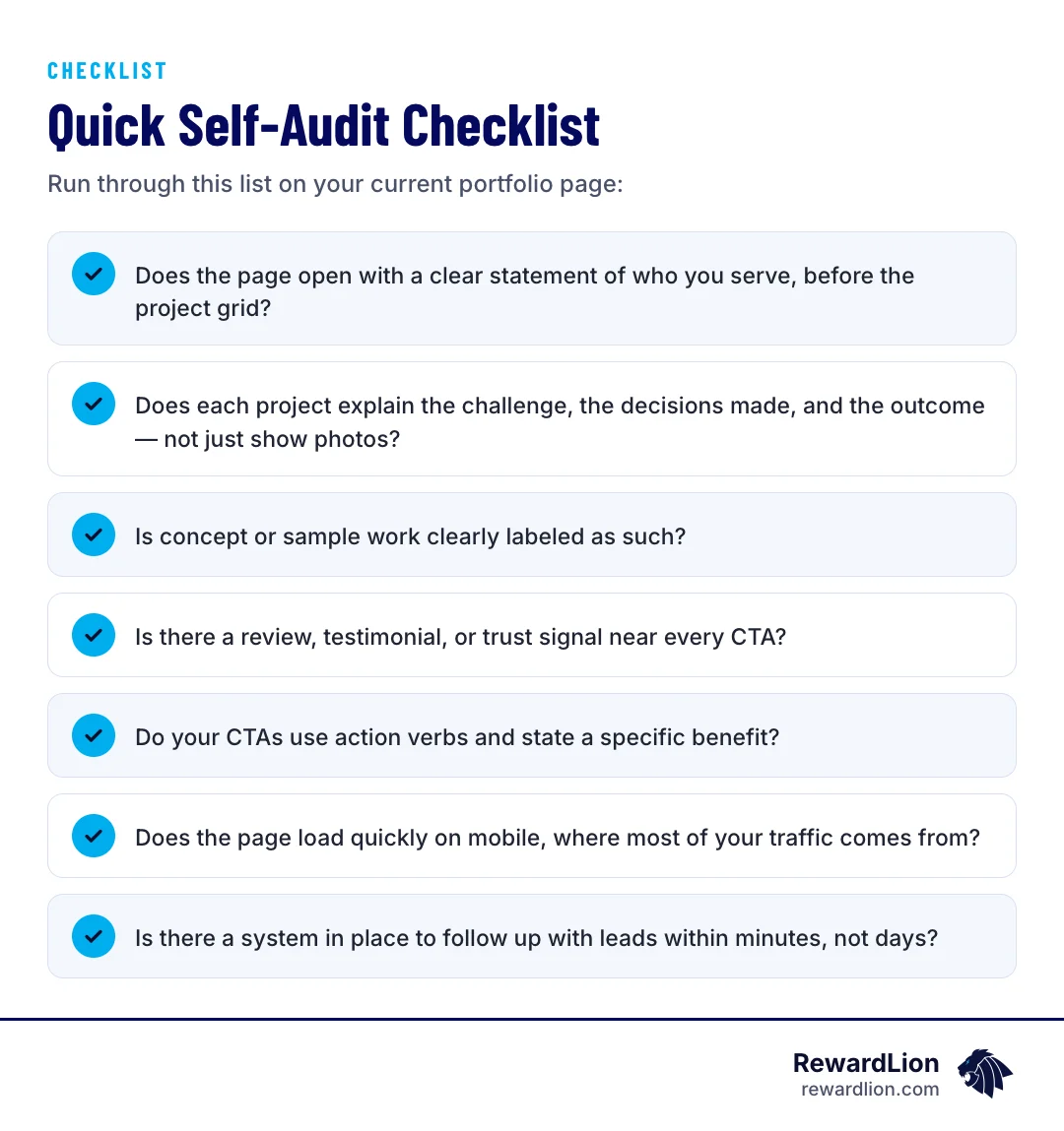
- Does the page open with a clear statement of who you serve, before the project grid?
- Does each project explain the challenge, the decisions made, and the outcome — not just show photos?
- Is concept or sample work clearly labeled as such?
- Is there a review, testimonial, or trust signal near every CTA?
- Do your CTAs use action verbs and state a specific benefit?
- Does the page load quickly on mobile, where most of your traffic comes from?
- Is there a system in place to follow up with leads within minutes, not days?
If you answered "no" to more than two of these, your portfolio page likely has more room to convert than it's currently capturing.
Want a second opinion on your portfolio page? Contact our team and we'll review it with you.
Related reading
- Stop Being the Best Kept Secret by Overhauling Your Personal Branding Strategies
- What Do Branding Agencies Actually Do: The Complete List of Services
- How to Use a Lead Generation Landing Page Builder to Double Conversions
- RewardLion lead generation solutions
FAQ
How is a portfolio page different from a landing page?
A landing page is typically built around one offer and one goal. A portfolio page serves a similar purpose for service businesses — it should guide visitors toward a single clear action, like requesting a quote — while also proving your work through case studies rather than a single offer.
How many projects should I show on a portfolio page?
There's no fixed number, but quality and structure matter more than quantity. A handful of well-documented case studies with clear challenges, decisions, and outcomes will typically do more for conversion than a long, unstructured gallery.
Do I need reviews on my portfolio page specifically, or is a separate testimonials page enough?
Placing reviews or trust signals near your CTAs, directly on the portfolio page, is more effective than isolating them on a separate page, since pages with testimonials convert notably higher than those without (fibr.ai).
What's the single biggest mistake service businesses make on their portfolio page?
According to common lead-generation research, it's usually one of three things: no clearly defined ideal client, no visible way to make contact, or no clear call to action (nusii.com). Fixing these often matters more than any visual redesign.

Sources
- Portfolio page design that converts
- How to design a lead generating portfolio that converts buyers
- How to Optimise Call-To-Action for Portfolio Website
- What is the average landing page conversion rate? (Q4 2024 data)
- 6 Ways to Make Your Design Portfolio Generate Leads
- 6 Portfolio Landing Pages to Showcase Your Skills & Get Clients
- Design Best Practices for Website Conversion
- 20+ Landing Page Statistics You Need to Know in 2026