Core Principles of Effective Commercial Poster Design
Effective commercial poster design relies on a structured visual hierarchy, a singular dominant focal point, bold high-contrast typography, and an unmistakable call to action. To cut through noise and convert passing viewers, a poster must deliver immediate clarity and emotional resonance before communicating detailed information. Understanding what makes a good advertisement poster comes down to mastering these optical principles and ensuring instant legibility from across a room.
The average person walks past hundreds of promotional messages every hour. If your layout tries to say five different things at once, it ends up communicating nothing. Every high-converting design operates under the 3-second rule: a pedestrian or driver must grasp the core hook, identify the product, and understand the value proposition within three seconds.
To win the 3-second rule, you must apply the 10-foot test. View your design from ten feet away (or zoom out to thumbnail size on your monitor). If the primary message or hero visual is not instantly legible, the visual hierarchy is broken.
An effective hierarchy follows a strict optical path:
Primary Focal Point: The dominant product image, hero subject, or bold visual hook.
Main Headline: A scannable statement communicating the offer or core benefit.
Secondary Detail: A brief supporting feature strip, date, or pricing note.
Call to Action (CTA): A clear instruction, URL, or scannable QR code directing the next step.
Mastering Typography Hierarchy in Commercial Poster Design
Typography in commercial advertising must prioritize legibility over artistic complexity. At distance, decorative fonts blur into visual noise. Ultra-bold sans-serif typefaces or clean modern serifs provide the structural weight needed for high-impact viewing.
Establish a clear scale across three typographic tiers:
Headline (Dominant Tier): Sized to occupy significant canvas real estate. This text must be legible from 10 to 20 feet away.
Subheadline / Value Proposition (Middle Tier): Roughly 30% to 40% of the headline size. This delivers context once the viewer’s eye is caught.
Action & Regulatory Copy (Base Tier): Clean, uncluttered contact details, URLs, or disclaimers positioned in the lower quadrants.
Pay close attention to tracking and kerning. Tight letter spacing that works on a business card will bleed together when scaled up to a 24×36-inch print. Always preserve generous safe zones—keep essential type at least 0.25 inches (6mm) inside the trim line to prevent edge clipping and optical crowding.
Harmonizing Colors and Product Semantics
Color is the fastest emotional shortcut in advertising. It signals category context before the brain even reads the headline. When creating an advertisement poster, the background and accent colors must reinforce the product's natural semantics.
For instance, food and beverage promotions rely heavily on warm, appetizing palettes—reds, oranges, warm yellows, and rich ambers—which naturally stimulate appetite. Cool tones like heavy blues, purples, or muted grays can inadvertently make food products look unappealing. Conversely, consumer tech and luxury items excel with sleek monochromes, deep indigos, and stark contrast that evoke precision and sophistication.
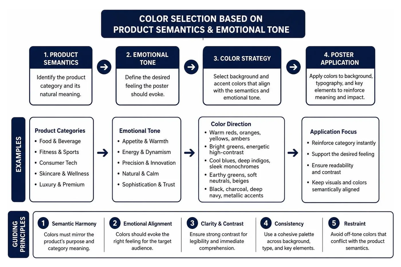
Academic research on commercial poster generation systems emphasizes semantic harmony: visual embellishments and environmental backdrops must mirror the product's purpose. A fitness beverage poster benefits from dynamic splash effects, condensation textures, and high-energy motion streaks, while an organic skincare product demands soft natural lighting, earthy undertones, and botanical accents.
The Step-by-Step Commercial Poster Design Workflow
Designing a high-converting poster is a structured engineering process, not guesswork. Whether you are creating a local event notice or a national retail rollout, following a sequential workflow ensures visual balance and message clarity.
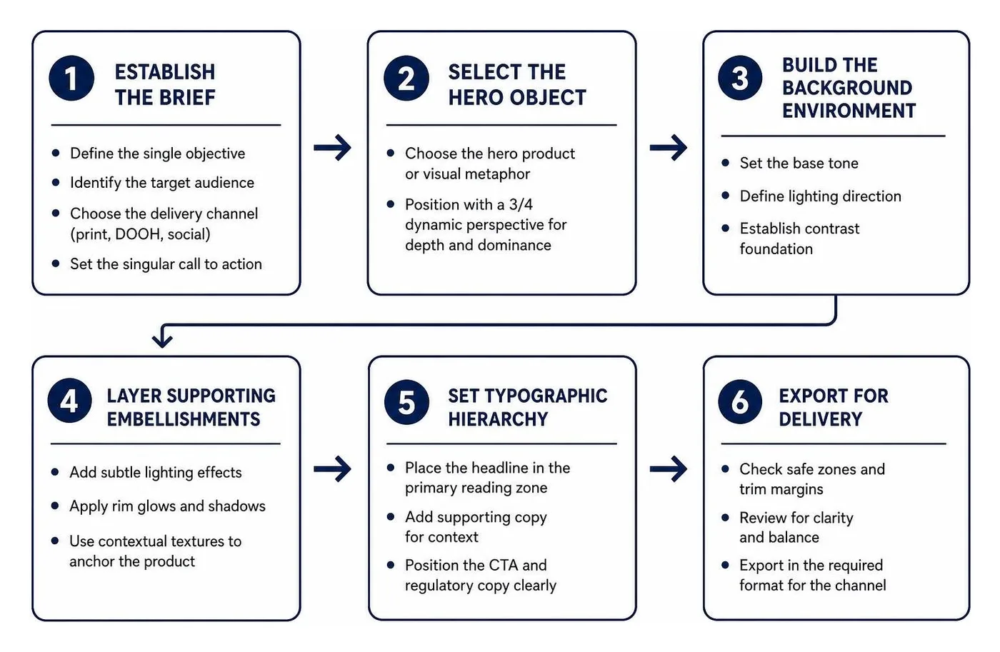
Establish the Creative Brief: Define the single objective, the primary target audience, the delivery channel (print, DOOH, social), and the singular call to action.
Select the Hero Object: Position your hero product or visual metaphor. A 3/4 dynamic perspective often provides the best depth and visual dominance.
Build the Background Environment: Establish the base tone, lighting direction, and contrast foundation. The background must push the hero object forward, never compete with it.
Layer Supporting Embellishments: Add subtle lighting effects, rim glows, shadows, or contextual textures that anchor the product in space.
Set Typographic Hierarchy: Place the headline, supporting copy, and CTA in natural reading zones.
Execute Quality Checks & Pre-Flight: Run the 10-foot test, verify bleed parameters, and ensure color spaces are properly mapped.
To see how these visual layers come together in live marketing campaigns, examine a practical poster advertisement example to see how space, color, and copy align in real-world applications.
Integrating Brand Assets into Commercial Poster Design
A poster must be instantly recognizable as an extension of your company's broader identity. Integrating established brand assets ensures that even if a passerby only catches a glimpse of the design, brand recall is reinforced.
When working with comprehensive branding services, creative teams establish precise guidelines for logo placement, font pairings, and color palettes.

Vector Logos: Always import logos in vector formats (SVG, EPS, or native AI) to prevent pixelation during large-format reproduction.
Brand Color Systems: Match background elements and accent typography directly to primary and secondary brand HEX/Pantone values.
Product Photography: Use high-resolution, professionally graded hero imagery with clean clipping paths.
Consistent Voice: Ensure the tone of the headline matches the brand persona—whether punchy and irreverent or authoritative and corporate.
Leveraging AI Tools for Concepting and Rapid Iteration
Generative AI tools have accelerated early-stage creative direction. Rather than spending days manually building mockups, design teams can test dozens of visual directions in minutes.
AI-assisted workflows allow you to:
Test Aesthetic Variations: Rapidly compare minimalist, retro, hyper-commercial, or illustrated looks for a single product shot.
Preserve Subject Identity: Use layout-aware image generation tools that keep the core product recognizable while altering lighting, backgrounds, and atmospheric effects.
Prototype Copy Placement: Generate compositions with built-in negative space specifically reserved for headlines and promotional badges.
For digital-first campaigns, these static concepts can be translated into dynamic product advertisement motion graphics, adding subtle movement, particle glows, and typography reveals that capture attention on digital screens.
Technical Standards for Print and Digital Out-of-Home Displays
A brilliant visual concept will fail if the technical output is configured incorrectly. Print production and digital displays operate on entirely different technical specifications.
Display Format | Standard Dimensions | Target Resolution | Color Mode | Recommended File Format | Primary Use Case |
|---|---|---|---|---|---|
Small Commercial Print | 11×17 inches | 300 DPI | CMYK | Print-Ready PDF | Community boards, window notices, counter displays |
Medium Promo Print | 18×24 inches | 300 DPI | CMYK | Print-Ready PDF | Retail storefronts, event promotions, venue walls |
Standard Commercial Wall | 24×36 inches | 300 DPI | CMYK | Print-Ready PDF | High-traffic retail, brand campaigns, trade shows |
Theatrical One-Sheet | 27×40 inches | 300 DPI | CMYK | Print-Ready PDF | Entertainment releases, transit shelters, illuminated kiosks |
Digital DOOH Billboards | 1920×1080 / 3840×2160 px | 72–150 DPI | RGB | PNG / MP4 (Motion) | Digital roadside billboards, highway displays |
Vertical Social Feeds | 1080×1350 px (4:5) | 72–150 DPI | RGB | PNG / JPG | Instagram, Meta ads, vertical mobile feeds |
Critical Print Specifications
Resolution: Commercial printing requires 300 DPI (dots per inch) at 100% scale. For a 24×36-inch poster, your canvas must be 7,200×10,800 pixels.
Bleed Margin: Always add a 0.125-inch (3mm) bleed around the entire canvas perimeter. This ensures that when the print shop trims the paper, no white borders appear.
Safe Zone: Keep all critical text, contact info, and logos at least 0.25 inches (6mm) inside the trim line.
Color Spaces: Convert print assets to CMYK to ensure colors match ink capabilities. Keep digital assets in RGB for maximum vibrance on illuminated screens.
Standard Sizing and Cross-Platform Adaptation
Modern campaigns rarely live on a single wall. Integrating your physical posters with broader effective advertising strategies requires designing modular layouts that adapt across multiple aspect ratios without losing balance.
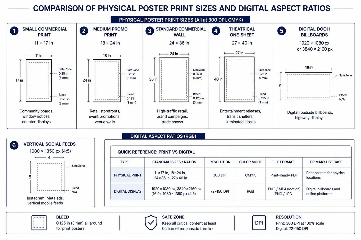
When adapting a master 24×36 print layout for a 4:5 vertical social feed or a 16:9 digital display:
Preserve the Anchor: Keep the hero product and main headline grouped together.
Refactor Negative Space: Expand or contract background textures rather than stretching the core subject.
Adjust Copy Scale: Increase font size slightly for mobile feeds where users view content on 6-inch screens rather than 3-foot physical boards.
Frequently Asked Questions About Commercial Poster Design
What is the standard resolution required for commercial poster printing?
The industry standard for commercial poster printing is 300 DPI at full physical scale. A standard 24×36-inch poster requires a file canvas of 7,200×10,800 pixels. For large-format digital out-of-home (DOOH) screens viewed from extreme distances, 150 DPI is standard to optimize file rendering speeds while maintaining sharp visual quality. Always export physical print files as high-resolution, vector-preserving PDFs with embedded fonts and CMYK color profiles.
How do you ensure a commercial poster passes the 10-foot test?
To pass the 10-foot test, establish a single dominant focal point that commands immediate attention. Scale your headline so it can be read effortlessly across a room, utilize high-contrast color palettes (such as bold light type on deep dark backgrounds or vice versa), and ruthlessly eliminate secondary clutter. If a viewer cannot identify the brand and the primary offer within three seconds from ten feet away, simplify the layout.
How do you resize a commercial poster for social media and digital billboards?
Resize commercial posters by designing in modular layers rather than flattening your file. When moving from a 24×36 vertical print poster (2:3 aspect ratio) to a 4:5 vertical social ad or a 16:9 landscape digital billboard, reposition the background, hero object, and typography independently. Expand the background environment to fit wider or taller dimensions, keep the hero product centered or weighted along the rule of thirds, and rescale typography to match the viewing distance of the target screen.
Conclusion
Commercial poster design is one of the most powerful ways to cut through daily advertising clutter, communicate immediate value, and turn passing foot traffic into active customers. By grounding your creative process in strict visual hierarchy, semantic color harmony, bold typography, and exact technical print standards, your campaigns will command attention in any physical or digital environment.
At RewardLion, we help growing businesses eliminate the friction of managing fragmented creative workflows. Our all-in-one AI-powered operating system connects branding, creative production, paid media, and omnichannel deployment under a single, unified growth platform. Whether you need high-impact print collateral, dynamic digital billboards, or full-scale multichannel campaign execution, our hybrid platform and dedicated CAPSS creative teams deliver hands-off marketing excellence.
Ready to elevate your visual marketing and launch campaigns that stop people in their tracks? Take the next step and explore what makes a good advertisement poster to see how unified creative execution drives real commercial growth.