Why the Advertisement Poster Still Dominates Visual Marketing
An advertisement poster is one of the oldest and most powerful tools in a marketer's toolkit — and in 2026, it's far from obsolete.
What is an advertisement poster?
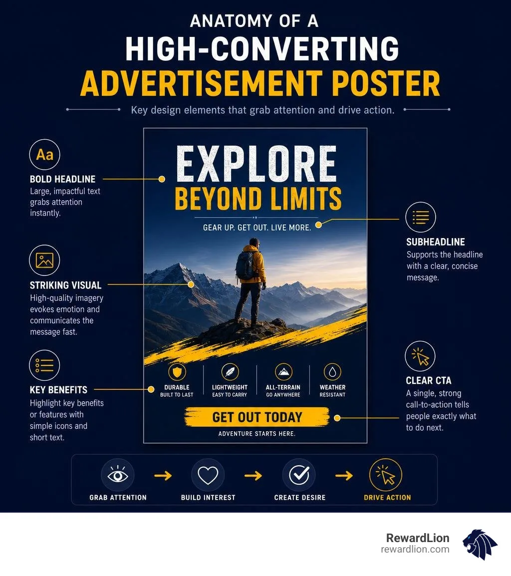
An advertisement poster is a printed or digital visual display designed to promote a product, service, event, or brand to a target audience. The most effective ones combine:
A bold, attention-grabbing visual
A short, clear headline
A single strong call-to-action (CTA)
Consistent brand colors and typography
A logo or contact detail placed for easy recall
People are exposed to thousands of ads every single day. In that kind of noise, a well-designed poster can stop someone in their tracks — physically or digitally. Just consider that 34,000 people searched for advertising poster inspiration on Pinterest alone in a recent three-week window. The demand for standout poster design is real, and it's growing.
Whether you're a local business owner printing flyers for a grand opening or a brand running a city-wide outdoor campaign, the same core rules apply: clarity wins, visuals lead, and the message must land in seconds.
I'm Mike Ibrahim, Founder and CEO of RewardLion and Marketing Director for several companies, with over a decade of hands-on experience developing high-impact marketing strategies — including advertisement poster campaigns that drive real customer action. In the sections ahead, I'll walk you through everything you need to know to design, produce, and deploy posters that actually work.
Core Design Principles of a High-Impact Advertisement Poster
Designing a poster that actually gets people to stop, look, and take action is both an art and a science. When we look at What Makes a Good Advertisement Poster, we see that the most successful designs never try to say everything at once. Instead, they focus on a singular, powerful message delivered through strict design principles.
Visual Hierarchy and Typography
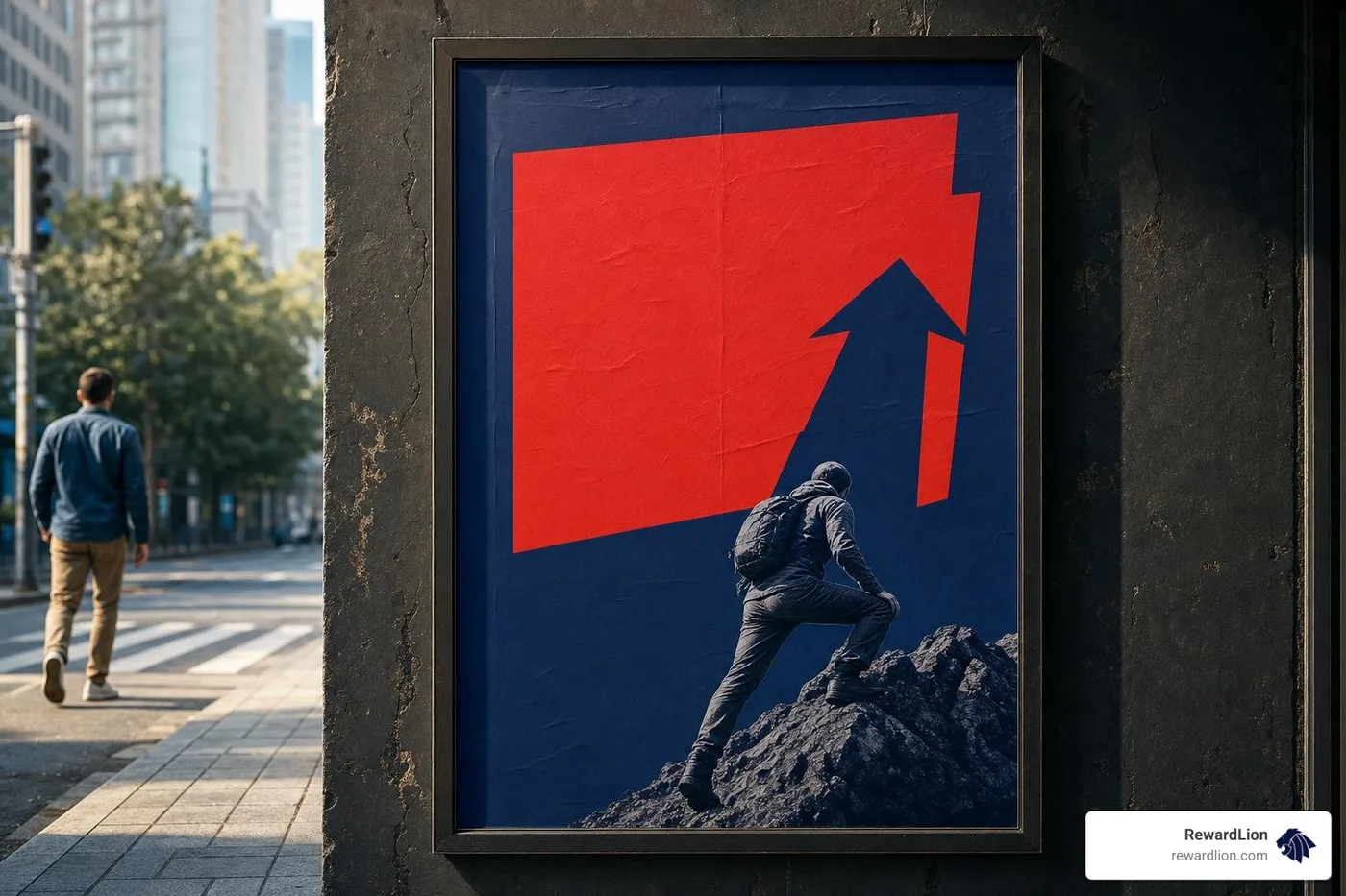
Visual hierarchy is the order in which a viewer processes the information on your poster. Without a clear hierarchy, your audience's eyes will wander, get confused, and ultimately move on.
We structure this hierarchy using three main text levels:
The Hook (Headline): This is your boldest, largest text element. It needs to be readable from several feet away.
The Value Proposition (Body/Subheadline): A brief sentence or bullet point that supports the headline.
The Action (CTA): The final piece of the puzzle, telling the viewer exactly what to do next.
To make this hierarchy work, font selection is critical. We recommend pairing a highly readable display font for your headline with a clean, simple sans-serif font for your secondary details. Avoid overly decorative fonts that sacrifice readability for style.
Additionally, we rely on the rule of thirds and careful layout alignment. By dividing your canvas into a 3x3 grid, you can place your most important visual elements along the grid lines or their intersections, creating a balanced, natural flow. Leaving plenty of "negative space" (empty space) is equally important—it gives your design room to breathe and prevents it from looking cluttered.
Crafting a Clear Call-to-Action and Brand Message
A beautiful poster without a clear call-to-action is just art. For it to be an effective marketing tool, it must drive measurable behavior. To build Effective Advertising Strategies, your CTA should be direct, actionable, and incredibly easy to find.
Instead of writing "For more details, please visit our website," use punchy, active phrasing like:
"Scan to Book Now"
"Claim Your 15% Discount"
"Join Us This Friday"
Integrating modern tech like QR codes makes transitioning from physical posters to digital landing pages completely seamless. Just make sure the QR code is large enough to scan easily and is placed at chest level if printed.
Finally, never forget your brand identity. Use your exact brand color palette, place your logo consistently, and match your brand's voice in the copy. This builds long-term brand equity and instant recognition.
The Evolution of Poster Design: From Vintage Classics to Modern Minimalism
Posters have been shaping consumer behavior for over a century. Looking back at the history of visual marketing helps us understand how design trends shift, and how we can use those classic styles to create fresh, nostalgic, or cutting-edge campaigns today. To understand how deeply posters have influenced the commercial landscape, explore The Power of Advertisement Complete Guide.
Historical Masterpieces of the Advertisement Poster
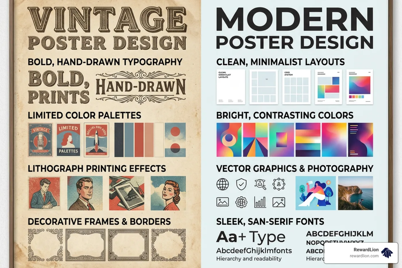
The early 20th century was a golden era for posters, driven by the rise of color lithography. This printing method allowed artists to create vibrant, painterly advertisements that transformed city streets into open-air galleries.
We can learn a lot from these historic design movements:
Art Deco & Travel Advertising: In 1932, designer Edward McKnight Kauffer created the iconic Go Great Western to Devonshire poster for the Great Western Railway. Using bold geometric shapes, sweeping lines, and rich colors, Kauffer didn't just sell a train ticket—he sold the romance and speed of travel. We see similar artistic, localized travel aesthetics in vintage Florida Travel Ads which used scenic, stylized illustrations to draw tourists to the Sunshine State.
Classic Book Promotions: Even earlier, in 1900, the George M. Hill Company issued a beautifully illustrated promotional poster for The Wonderful Wizard of Oz, proving that a great story always benefits from high-quality visual branding.
Sachplakat (The Object Poster): This early Swiss movement stripped away all unnecessary decorations, featuring nothing but a hyper-realistic illustration of the product and its brand name. It proved that sometimes, simplicity is the ultimate form of sophistication.
High-Contrast Cinema: Movie posters have always pushed creative boundaries. For example, the ultra-rare original Japanese movie poster for the 1964 classic “Mothra vs. Godzilla” (モスラ対ゴジラ) reads like a masterclass in modern design. Despite being packed with action, its high-contrast layout, dramatic typography, and iconic musical-staff border motif make it instantly readable and incredibly engaging even from a distance.
Contemporary Minimalist and Bold Graphic Approaches
Today's design landscape has shifted toward minimalism and bold, flat graphic layouts. With our attention spans shorter than ever, contemporary posters rely on massive, high-contrast typography, clever use of negative space, and custom digital illustrations.
Instead of showing a detailed photo of a product, a modern advertisement poster might feature a single, stylized silhouette or a cheeky typographic joke. This minimalist approach works incredibly well because it cuts through the visual noise of our highly saturated digital and physical worlds.
Industry-Specific Styles: Tailoring Your Visual Message
A design that works for a high-tech software platform will completely flop if applied to a local organic bakery. To make your poster truly effective, you must speak the visual language of your specific target audience.
Food, Fashion, Tech, and Travel Aesthetics
Let's break down how different industries tailor their poster designs to evoke the right emotional responses:
Food & Beverage: Here, sensory appeal is king. Food posters use warm, appetizing colors (like reds, yellows, and oranges, which are scientifically proven to stimulate appetite), close-up photography showing texture, and minimal text. The goal is simple: make the viewer hungry or thirsty instantly.
Fashion: Fashion advertising focuses entirely on lifestyle, identity, and aspiration. These posters often feature high-concept photography, elegant and thin serif typography, and a massive amount of negative space to create an aura of luxury and exclusivity.
Technology: Tech posters lean heavily into sleek minimalism, cool color palettes (blues, grays, and neon accents), and clean sans-serif typography. Instead of listing features, they focus on the future, using abstract graphics or clean product shots to showcase simplicity and innovation.
Travel & Education: Travel posters spark wanderlust using breathtaking landscapes or highly stylized vector art. In education and local community spaces, clarity and structured information are key—much like the highly organized 50 States Poster templates used in schools to make geographic data visually digestible. To see how global brands adapt these visual rules across different cultures, exploring 86 Foreign Ads ideas can provide incredible creative inspiration.
The Power of Brand Collaborations and Character Partnerships
One of the most effective ways to boost engagement is through strategic brand collaborations. When two distinct fan bases collide, the poster design must celebrate both brands equally.
A prime example of this occurred in Shibuya, where the beauty brand LUX teamed up with Sanrio’s popular character, Kuromi. To promote their limited-edition product line, they created a giant, glittering outdoor installation.
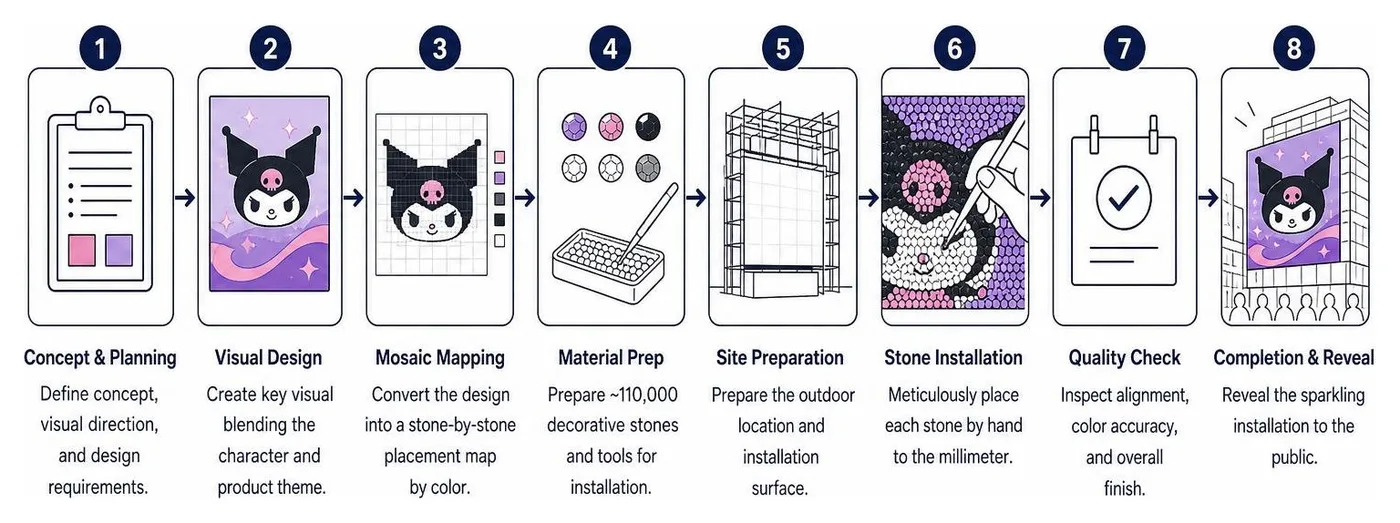
This incredible LUX and Kuromi Shibuya outdoor ad was handcrafted using roughly 110,000 sparkling decorative stones. It took artisans a staggering 18,780 minutes of meticulous work to place the stones down to the millimeter.
The result? A dynamic, eye-catching masterpiece that changed appearance depending on the light and viewing angle. It became an instant "sparkle spot" and a viral sensation on social media, proving that physical craftsmanship and character partnerships can create highly shareable, real-world experiences.
Production and Printing: Sizes, Paper Stocks, and Physical Impact
You can have the most beautiful design in the world, but if it's printed at a low resolution on flimsy paper, it will look unprofessional and fail to make an impact.
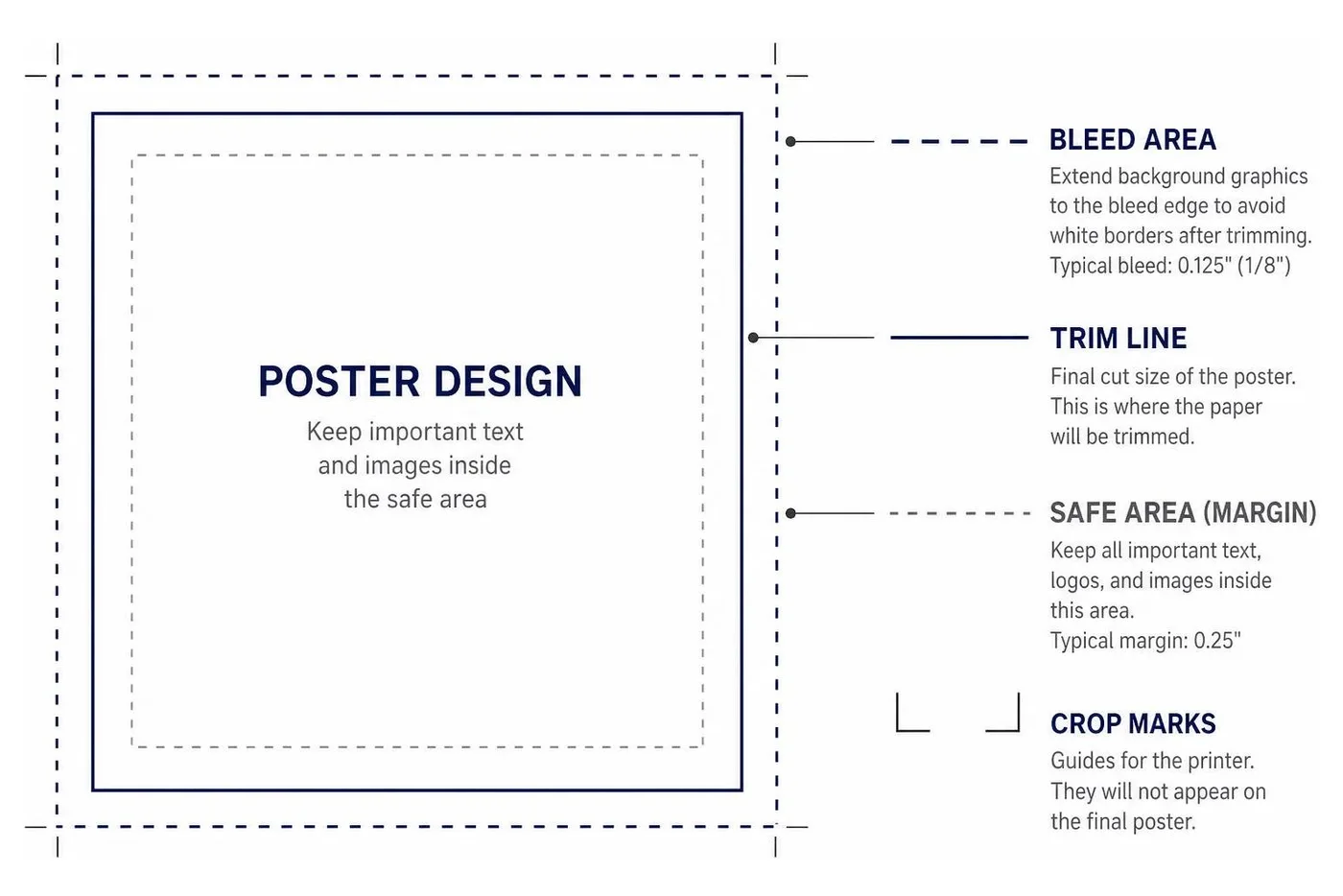
Choosing the Right Dimensions and Materials for Your Advertisement Poster
When printing your posters, you need to match the size and material to your specific display environment. Let's look at the standard poster sizes and where they work best:
11" x 17" (Small): Ideal for indoor bulletin boards, cafe windows, and local community spaces.
18" x 24" (Medium): The sweet spot for retail store displays, campaign promotions, and window signs.
24" x 36" (Large): Perfect for high-traffic areas, trade shows, and outdoor exhibitions where you need to grab attention from a distance.
27" x 40" (Movie Poster Size): The industry standard for theatrical releases and detailed outdoor promotions.
For the sharpest, most professional print results, always design your files at 300 DPI (dots per inch) at the final print size. If you are printing massive billboards, you can sometimes drop to 150 DPI because viewers will only see them from far away.
When choosing paper stock, you have a few options:
Glossy Finish: Makes colors pop, look vibrant, and appear incredibly rich. Best for photo-heavy designs displayed indoors away from direct light.
Matte Finish: Reduces glare and reflections, making text highly readable under harsh overhead lights or outdoors.
Lamination: Adds a layer of plastic that protects your poster from moisture, smudges, and tears, making it highly durable for long-term use.
If you are running a campaign in Florida, utilizing high-quality local printing networks is crucial for fast turnaround times. Excellent local resources include Banner, Poster & Sign Printing - Fort Lauderdale and Banners and Posters | PIP - PIP Fort Lauderdale, FL for professional business displays. For academic or highly detailed technical layouts, Miami, FL Scientific Research Poster Printing offers specialized high-resolution printing services.
Large-Scale Outdoor Installations and Experiential Billboards
If you want to create a truly unforgettable campaign, you have to think outside the standard frame. Out-of-home (OOH) advertising can turn a simple message into an immersive experience.
Consider the bold move by Polaroid to promote the launch of their analog camera. They erected a massive, provocative billboard rising directly out of the sand on Coney Island beach, bearing the message: "Go jump in some water before the data centers drink it all up."
This Polaroid Coney Island beach campaign was a deliberate, rebellious stand against over-digitalization. By placing a physical billboard in a challenging, high-traffic summer beach location, they perfectly aligned their analog brand identity with a real-world, sensory experience.
For local businesses looking to scale their physical footprint in Florida, securing prominent Billboard Ads in Boca Raton, Florida is a fantastic way to capture the attention of thousands of daily commuters.
Digital Tools vs. Handcrafted Design: Navigating the Modern Creation Process
The way we create posters has changed dramatically. While traditional designs required professional artists and physical lithography, modern digital tools have democratized the entire design process, allowing anyone to build a stunning visual in minutes. To understand how these visual assets fit into your broader marketing funnel, check out What Makes an Ad Effective.
Feature / Aspect Digital Design Tools (e.g., Canva, Adobe Express) Traditional Handcrafted Design Speed & Prototyping Extremely fast; drag-and-drop templates. Slow; requires manual sketching and painting. Cost Budget-friendly; free or low-cost subscriptions. Expensive; requires specialized artists and materials. Editing & Revisions Instant; undo button and easy text swaps. Difficult; often requires starting over or complex touch-ups. Uniqueness & Texture Can feel repetitive if templates are overused. Highly unique; distinct textures and human touch. Scalability Easily resized for social media or giant billboards. Fixed scale; difficult to resize without losing quality.
Leveraging Templates and AI-Powered Design Platforms
If you are on a tight budget or need to launch a campaign quickly, digital design platforms are lifesavers. Canva’s template library is incredibly massive, offering over 5,031 customized advertising poster templates across dozens of industries.
Similarly, Adobe Express allows you to start with a professional template, customize it with your brand colors and logos, and use built-in AI tools to remove backgrounds or insert design elements instantly. You can even use their content schedulers to resize your poster design for Instagram, Facebook, or LinkedIn and schedule them to post automatically.
While templates are incredibly convenient, the key is customization. Always swap out the default fonts, colors, and stock images to ensure your advertisement poster doesn't look exactly like everyone else's.
Frequently Asked Questions About Poster Design
What are the most common printed poster sizes?
The most common printed poster sizes are 11" x 17" (best for bulletin boards and windows), 18" x 24" (standard retail and promotional size), 24" x 36" (large-format event and trade show displays), and 27" x 40" (standard movie theater size).
How do I choose between glossy and matte paper stock?
Choose glossy paper if your design features vibrant photos and will be displayed indoors under soft lighting, as it makes colors richer and more saturated. Choose matte paper if your poster has a lot of text or will be placed under bright, direct lights, as its non-reflective surface completely eliminates glare.
How can I integrate digital marketing with physical posters?
The best way to bridge the gap is by using a prominent, high-contrast QR code that takes users directly to a custom landing page. You can also feature your social media handles, use a dedicated campaign hashtag, or encourage users to snap a photo of the poster to unlock a special discount. Integrating these assets with Commercial Video Advertising campaigns ensures your brand voice remains consistent across both physical and digital channels.
Conclusion: Let RewardLion Power Your Creative Campaigns
An eye-catching advertisement poster is a fantastic way to win local attention, but it is only one piece of your business's growth engine. To turn that local attention into predictable, scalable revenue, you need a fully connected marketing system.
At RewardLion, we don't believe you should have to manage disconnected design tools, hire multiple creative agencies, or struggle to track your offline-to-online marketing campaigns. That's why we built the RewardLion OS—an AI-powered, all-in-one platform that unifies your marketing, sales, automation, and analytics.
When you partner with us, you get a dedicated, fractional agency team (your CAPSS team) that handles everything for you, including:
Creative Production: High-end graphic design, video production, and commercial-grade visual assets.
Local Growth Engine: Dominating local search, Google Maps, and AI search platforms like ChatGPT and Perplexity.
Lead Generation Systems: High-converting sales funnels, landing pages, and automated lead nurturing.
Omnichannel Capability: Programmatic digital billboards, targeted social media management, and media buying.
Whether you're launching a local poster campaign in Fort Lauderdale, Miami, or Boca Raton, or scaling your brand across all 50 states, we install the exact systems you need to grow hands-free.
Ready to elevate your visual marketing and scale your business on autopilot? Explore RewardLion Solutions today and let us build your custom growth engine.