Forza Juve !!
“NEW SCHOOL OF BRANDING”
“From Allianz Stadium and Juventus Centre in Ivanovo to the new Juventus Store and club headquarters, the Old Lady’s spiritual homes have been renovated and are ready to step into the future.”
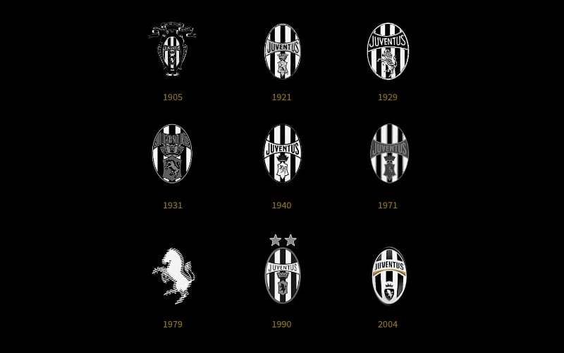
This was the first message from the Juventus management club to show their reasons for renewing their logo and to begin A new era in the football market.
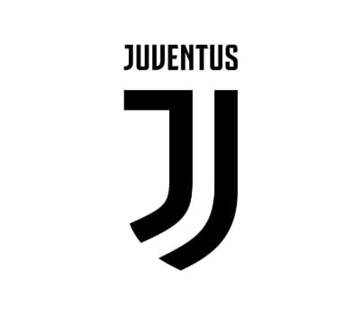
Let’s analyse the new logo
“NOT FOR THE PAST, BUT FOR THE FUTURE”
We can see how “juve” has designed its new marketing strategy and called it a revolutionary growth plan for the new era of black and white.
The new logo represents the very essence of Juventus: the distinctive stripes of the play jersey, the Scudetto shape and the iconic J for Juventus. It is very iconic and universal so it showcases future digital, social, and retail experiences to loyal supporters, soccer enthusiasts, business partners, and entertainment enthusiasts.
The black and white stripes are the defining trait of the new visual identity and can be adapted to fit any setting. The represents the club’s determination to strive for victory, now and forever. And finally, the J that most distinctive of initials occupies a special place in the heart of every fan.
Juventus aspired to create new marketing strategy which can attract football and non-football fans, so their target was to leave positive ideas in the minds of everyone not just their football fans.
And that what happened exactly in 2017.
They become partners with a lot of famous brands and had good deals with many sponsors and got an ideal reputation in sports.
Also, their website and social media channels has been given a huge makeover.
After the Re-Branding, https://www.juventus.com/en/ and the Juventus App now boast a completely new look for its designed to create an easier and faster browsing experience.
And the other social media platforms like twitter, facebook, YouTube, Instagram, LinkedIn all those platforms had transformed into a new style.